

Cricket’s Second Screen Revolution is Here
Indian cricket fans have evolved. While the TV shows the match, smartphones provide the real edge. From win-probability graphs to complex ball-tracking, data apps are transforming how we watch the game.
- Graphs: Spot turning points instantly.
- Ball-tracking: Analyze every bowler’s rhythm.
- Wagon wheels: Track scoring patterns.
Data isn’t just numbers; it’s the ultimate match-day companion for the modern fan.
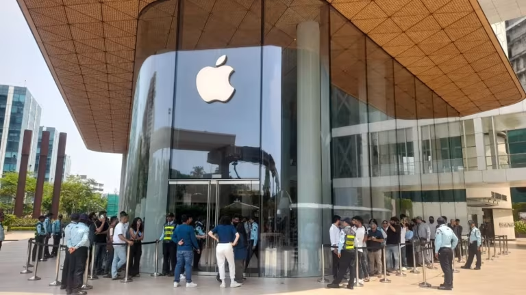
Apple India Hits Massive ₹1 Trillion Milestone
Apple India has officially shattered records, crossing the ₹1 trillion revenue mark in FY26! While this massive scale proves Apple’s dominance in the local tech market, the data remains a mystery. We still don’t know the profit margins or which specific products drove this surge. Is it pure demand or just aggressive expansion? Stay tuned as we decode the growth!

Ramya Krishnan to Host Bigg Boss Tamil 10?
Bigg Boss Tamil 10 is heating up! Rumors suggest the legendary Ramya Krishnan might join as a guest host. Fans are buzzing about her potential to bring sharp wit, elegance, and intense drama to weekend episodes. While Kamal Haasan remains the main host, Ramya’s star power promises a fresh, authoritative twist. Stay tuned—official confirmation is still awaited for this epic update!
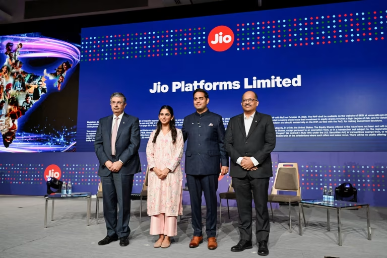
Jio Platforms IPO: India’s Biggest Ever!
The wait is over! Jio Platforms’ massive ₹30,213 crore IPO is officially live. Bidding runs until October 23, 2026, with shares priced between ₹1,065 and ₹1,119. Early buzz suggests massive demand, with the issue seeing strong subscription within minutes. Aiming to clear debt and fuel growth, this record-breaking offer is the ultimate test for India’s digital backbone. Ready to invest?

SBI Data Breach: 3,897 Records Exposed
State Bank of India has confirmed a massive security breach, with 3,897 customer records surfacing on the dark web. While core banking remains secure, sensitive personal details like phone numbers and addresses are compromised. Stay alert: scammers may use this data for phishing. Never share your OTP or PIN, and report any suspicious activity immediately to cybercrime.gov.in to stay safe.

Anthropic’s Massive $450B AI Gamble
Anthropic’s draft IPO filing reveals a staggering $16.3 billion in revenue, yet an $80.7 billion paper loss. Don’t panic—$72 billion stems from accounting adjustments, not cash burn. The real story? A massive $450 billion compute bet. With $9 billion spent on infrastructure in six months, Anthropic is racing to secure chips, despite cloud partners limiting their supply. High stakes ahead!
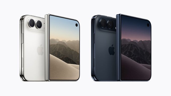
Apple’s Foldable iPhone Duo Sells Out!
The iPhone Duo frenzy is real! Apple’s first foldable vanished in under an hour, with only 6,000 units hitting India. Missed out? New orders are delayed until January 2027. While grey-market imports are surging, they lack official warranty support. With prices hitting ₹4.5 lakh, experts advise patience. Don’t risk your investment—wait for official stock to stabilize before buying this complex tech.

OPPO Reno 16 Price Hits ₹79,999!
OPPO has hiked Reno 16 prices again, citing a global memory chip crisis. The 8GB model now costs ₹72,999, while the 12GB variant reaches a staggering ₹79,999. With a mid-range Snapdragon 7 Gen 4 chip, this price point is controversial. Before buying, compare specs against true flagships, as the current market surge makes this mid-range device a tough sell for value seekers.

NVIDIA DLSS 4.5: Massive Gaming Upgrade
GeForce RTX gamers, gear up! NVIDIA just dropped a massive DLSS 4.5 update across major titles. Cyberpunk 2077 and Modern Warfare 4 lead the charge with enhanced AI performance. RTX 50 series users get insane 6X frame multiplication, while new drivers eliminate shader compilation lag. From Planet Zoo 2 to Phantom Blade Zero, your gaming experience is about to get significantly smoother.
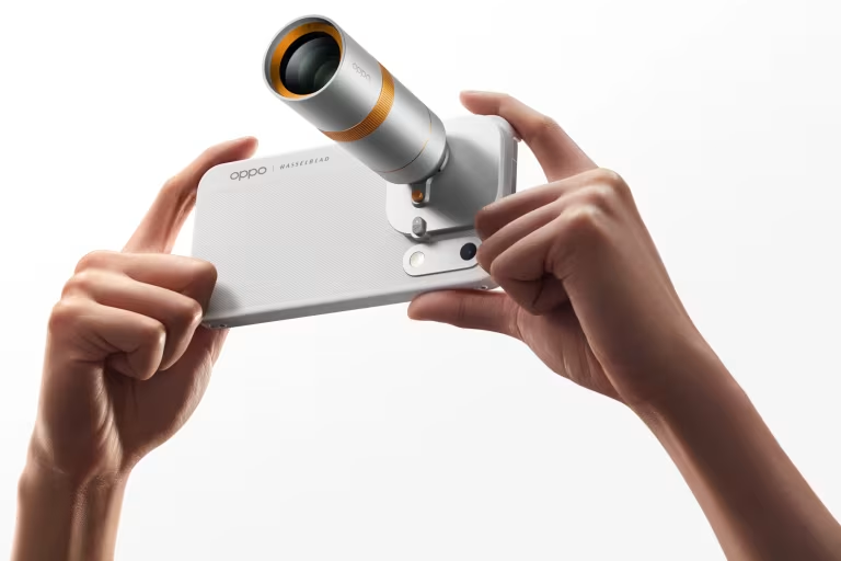
OPPO Find X10 Series: Premium Pricing Revealed
OPPO has officially launched the Find X10 series in India, and the prices are massive! The Find X10 starts at ₹1,39,999, while the top-tier Pro Max hits a staggering ₹1,99,999. With the Pad Mini at ₹94,999 and Enco X4 at ₹19,999, OPPO is aiming for the ultra-premium market. Are these flagship prices justified for your next tech upgrade?
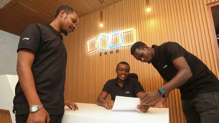
Zoho Overtakes Google in Africa
Zoho is rapidly winning over African startups, leaving Google Workspace behind. By offering local currency payments, dedicated regional support, and aggressive pricing, the Indian software giant is capturing a massive market. Nigerian firm Flexisaf alone expects to save nearly $7,000 annually. While Google still leads in developer ecosystems, Zoho’s localized strategy is proving that cost-conscious markets prioritize value and accessibility.