

In April 2023, WhatsApp began testing a navigation bar placed at the bottom, for Android users. A year later this updated design was officially rolled out to all users. A recent announcement on X/Twitter revealed that WhatsApp for Android now features a navigation bar making it easier to access with your thumb. The navigation bar has also received a look.

More About WhatsApp Easing Navigation
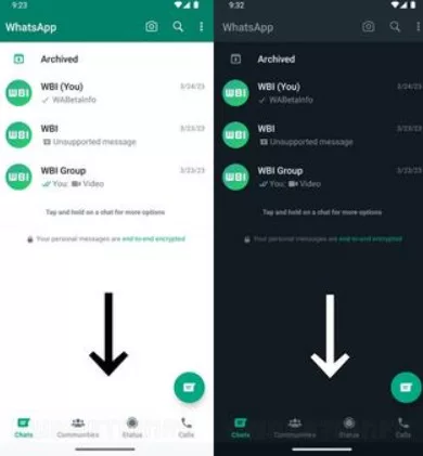
Previously the navigation bar had a color scheme. Included small and large tabs for different sections like Communities, Chats, Status, and Calls. Now the updated version showcases a white color scheme with tabs for all four sections each displaying its own icon. These changes give the navigation bar a modern appearance. The update has been released globally as part of version 2.24.6.77; users are advised to update their app through the Play Store to enjoy the design.
As summer approaches Google has introduced three features for Google Maps on both Android and iOS devices to enhance user experience during vacations. Google is working on improving Google Maps for Android to enhance the user experience. According to a blog post highlighting three features, Google mentions that users can expect to see updated designs that will give Maps a modern look featuring a simplified home screen, with fewer tabs.
According to a recent report from 9To5Google, Google confirmed to the publication that by “cleaner home screen with fewer tabs,” the reference is to the bottom bar rather than the carousel displaying suggestion cards.

This implies that Google Maps for Android will soon display fewer tabs in the bottom bar, contributing to a cleaner appearance. However, there are concerns about whether reducing the number of tabs may complicate app navigation. Presently, there is no specified rollout date for the revised bottom bar, but it is anticipated to become available in the coming weeks.