

Finally, the developers at Google have decided to give their Play Store a new look and UI update. The last time the Android store had its UI updates was way back in 2019. During that year, the Android Store received its first Material Design update, and we fell in love at first sight.
Over time the Play Store has received several small UI updates and little design changes, however, it had never received a major UI overhaul. But, now the Google Play Store has received a new addition to its UI update, and the developers have finally got rid of the hamburger menu.
There have been many changes in the UI starting from the removal of the hamburger menu. Everything has been moved under the profile section located in the top right corner. So, for those using multiple accounts, you can now find them under the collapsable drop-down menu.
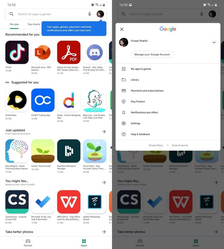
Everything which was part of the hamburger menu is now being added below the account tap option. The library has replaced the Wishlist, while Payments and subscriptions are now merged.
However, other than those, the remaining section of the Play Store has not received many changes at all. The sections such as My apps & games, Play Protect, Notification, and offers, and Settings menu are still the same.
Settings option has also received some changes with all options and preferences now being divided into four collapsable categories, which cleans everything up since before that, everything was just a mess of a giant list.
The changes in the UI have arrived in all the users of Android and I hope everyone is enjoying the UI as much as I am.