
The most recent change to YouTube Music’s virtually continual evolution and change is a total overhaul of the standard Android playlist display. This was previously observed in testing in 2022, although that time it was only observed operating on Android tablets rather than on mobile devices. The revamped YouTube Music playlist is now rolling out and showing up on more devices, as first noted by Android Police.
As we’re seeing variances across a number of devices, including on Android but not yet on iOS, not everyone has this updated view just yet. Since Google Play Music was discontinued in 2020 and YouTube Music replaced it as the exclusive music streaming service, the left-aligned playlist view has become a common sight.
The album art collage is centred when you open a playlist that has been generated or assembled. The playlist’s creator and the date of its most recent modification are noted in the first two lines or subheadings.
The cover art then displays, featuring the circular logo for YouTube Music in the upper left corner and highlighted photographs of the artists on the left and vertical text on the right.
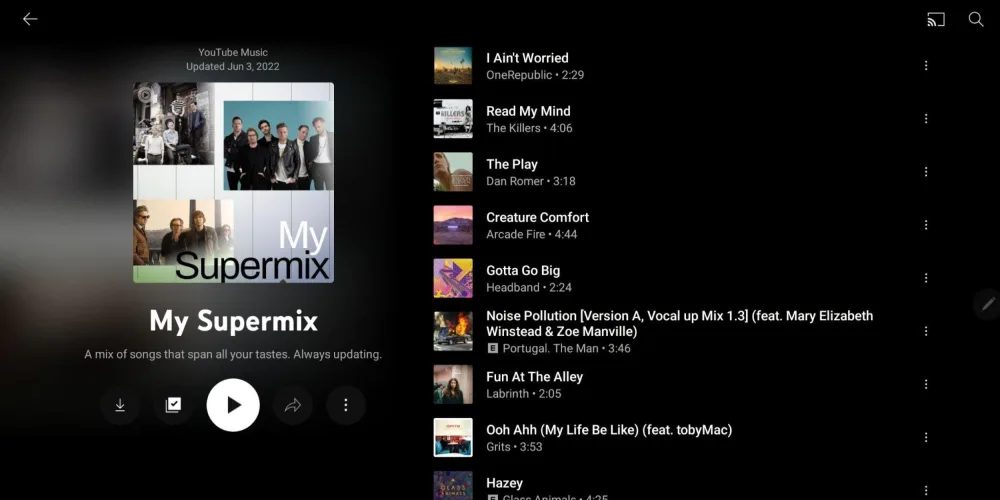
You can download, edit, share, and access more information by using the larger, more obvious options that are located beneath this section. A main “Play” button that starts playing is surrounded by smaller buttons with outline designs. Oddly, this layout does not include the “Shuffle” button. You actually need to hit the overflow three-dot button to get to this. As part of the revamp of the YouTube Music playlist, that change is undoubtedly irritating and is likely to confuse some users.
It could be good forcing the application to close and cleaning the app cache if you have not yet noticed the changes. On numerous of our own devices, the YouTube Music app’s redesigned playlist user interface was made possible by this forced manner.
Also Read: