
In the dynamic world of mobile gaming, user interface can make or break a player’s experience. Pokemon TCG Pocket, the latest digital iteration of the beloved card game, finds itself at a critical juncture where community feedback is reshaping its design philosophy. What began as a simple Reddit post by user Vaucha has blossomed into a passionate discussion about accessibility, navigation, and the art of creating truly player-centric design.
Table of Contents
Pokemon TCG Current UI Challenge: A Navigational Nightmare
Complexity vs. Convenience
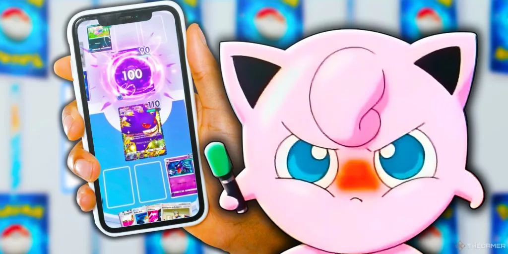
The existing Pokemon TCG Pocket interface presents a significant hurdle for players. Currently, card packs are rigidly organized by release and expansion sets, forcing users to navigate through multiple menus just to access older collections. This design creates unnecessary friction, potentially alienating both new and experienced players who seek a seamless gaming experience.
The Community’s Proposed Solution
A Swipe-Friendly Future
User u/Vaucha’s proposed solution is elegantly simple: a side-by-side pack layout that allows players to swipe left or right to select their desired card pack. This approach would eliminate the current multi-click navigation process, making pack selection intuitive and instantaneous.
Community Voices: A Chorus of Frustration and Hope
Player Perspectives
The Reddit thread reveals a spectrum of user experiences:
- u/gibbodaman highlighted how the current layout risks new players completely missing older pack options
- u/WallyGamer32 expressed frustration about the lack of a “last opened pack” memory feature
- Some users, like u/Maskey62, cautioned about potential interface clutter with a full swipe system
UI Evolution Breakdown
| Current System | Proposed Solution | Potential Benefits |
|---|---|---|
| Multiple Menu Clicks | Horizontal Swiping | Faster Navigation |
| Chronological Sorting | Flexible Pack Access | Improved User Experience |
| Limited Visibility | All Packs Visible | Better Pack Discovery |
The Pokemon TCG Pocket UI discussion is more than a technical debate—it’s a powerful example of how community feedback can drive meaningful digital design improvements.
The Potential Impact
More Than Just a UI Tweak
This discussion represents more than a simple design suggestion. It’s a testament to the Pokemon TCG community’s engagement and their desire for a more intuitive digital experience. The passionate feedback suggests that DeNA, the game’s developers, have an opportunity to significantly enhance player satisfaction.
EA FC25 Immortality League: Unlock 92-Rated Paolo Maldini in Ultimate Team
Frequently Asked Questions
Q1: Why Is the Current UI Considered Problematic?
The existing interface requires multiple clicks to access different pack sets, making navigation time-consuming and potentially confusing for new players.
Q2: What’s the Main Suggestion for Improving the UI?
A side-by-side pack layout with horizontal swiping, allowing quick and easy access to all available card packs.