
Mumbai City FC new logo revealed: The 22/23 ISL winners have revealed their new logo after weeks of anticipation. Mumbai City FC’s new logo is circular, a nod to the rest of the City Football Group clubs, including the Premier League’s Manchester City.
They have incorporated various important landmarks from Mumbai as an ode to the city, with the Bandra-Worli bridge and a horizontally depicted train placed front and centre of the badge. The Arabian Sea, one of the other defining features of the city, has also found its way into the logo.
Mumbai City FC new logo: Brand new identity for club ahead of 10th anniversary
“It gives me great pleasure to ring in the next chapter in the great history of Mumbai City FC with the launch of our new crest. At Mumbai City, we have always strived to build an institution that the Mumbaikars can relate to and one they can be proud of. While we continue to work hard to bring success on the pitch for the fans, it was crucial that we involved our supporters in a landmark decision such as this one. Our new crest reaffirms our commitment to preserving Mumbai City’s identity albeit with a modern outlook, as well as aligning ourselves visually within the City Football Group family,” the CEO of the club, Kandarp Chandra, said.
The new crest also has a nod to their former logo, with two fortresses shown on each side of the white panel. “Mumbai City Football Club” is written on the frontal part of the white panel, completing the new design.
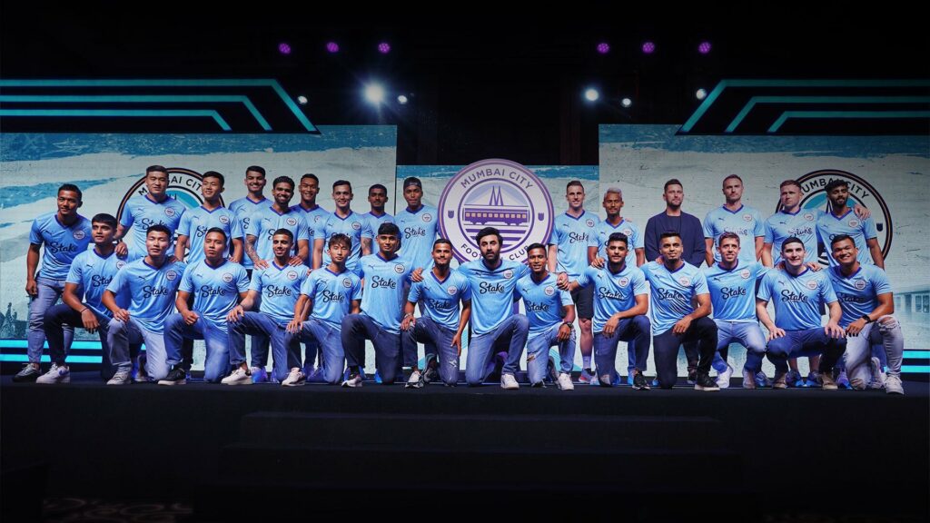
The launch event also saw the unveiling of the first team’s new kit ahead of the 23/24 season. It is the first to feature the new logo of the club and will be officially changed from July 14.