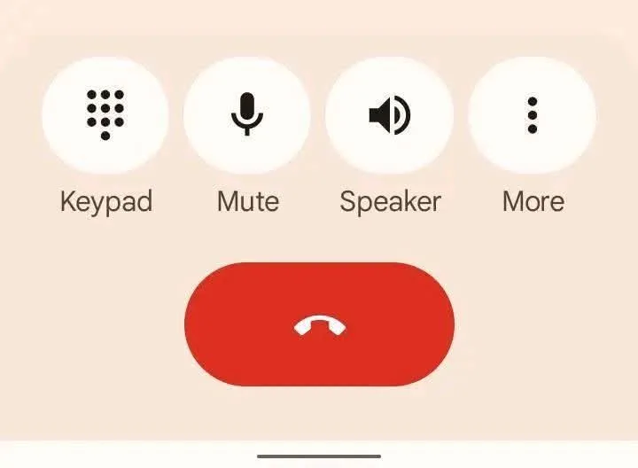
Picture this: You wake up Monday morning, grab your phone to make an important call, and suddenly freeze. Your familiar dial pad has transformed overnight. The numbers look different, the colors have changed, and for a split second, you wonder if someone has tampered with your device. Sound familiar? You’re not alone in this digital bewilderment.
Across the globe, millions of Android users have been experiencing this exact moment of confusion, flooding tech forums and social media with questions about their “hijacked” dial pads. But here’s the plot twist that would make any mystery novelist proud: there’s no villain in this story – just Google being Google, quietly revolutionizing your smartphone experience while you sleep.
Table of Contents
The Culprit Behind the Change: Material You 3.0
The mastermind behind this overnight transformation isn’t a hacker or a glitch – it’s Google’s ambitious design philosophy called “Material You (Material 3) Expressive.” Think of it as Google’s attempt to make your phone feel less like a cold, corporate device and more like a personal companion that reflects your style and preferences.
This new design aims to make the interface more appealing, interactive, and user-friendly by emphasising dynamic colours, flexible shapes, animations, and personalisation features, essentially turning your phone into a digital chameleon that adapts to your personality and usage patterns.

What Exactly Changed? A Visual Revolution
The transformation goes deeper than just aesthetics. Google has fundamentally reimagined how we interact with our most basic phone functions:
| Design Element | Old Version | New Material You | User Impact |
|---|---|---|---|
| Color Scheme | Static blue/white | Dynamic, personalized colors | Matches your wallpaper theme |
| Button Shapes | Traditional circles | Flexible, expressive shapes | More modern, touch-friendly |
| Animations | Minimal transitions | Smooth, responsive animations | Enhanced visual feedback |
| Typography | Standard font | Adaptive typography | Better readability |
| Personalization | One-size-fits-all | AI-driven customization | Unique to each user |
The Domino Effect: It’s Not Just Your Dial Pad
Here’s where the story gets interesting. The new look is not limited to the Phone app alone. Google has already introduced the same design in Google Contacts and Google Messages, ensuring a consistent experience across its ecosystem. It’s like Google decided to renovate your entire digital house, room by room, ensuring every corner matches the new aesthetic.
This synchronized rollout means your messaging app, contacts, and calling interface now speak the same visual language. For some users, this creates a seamless, cohesive experience. For others, it feels like waking up in someone else’s home.
The Human Side: Why People Resist Change
Let’s be honest about something that tech companies often overlook: humans are creatures of habit. That dial pad you’ve been using for years wasn’t just a interface – it was muscle memory, comfort zone, and familiarity all rolled into one. When something so fundamental changes overnight, it triggers a primal response that goes beyond mere preference.
Dr. Sarah Chen, a UX psychologist, explains: “When users say they hate an interface change, they’re often expressing a deeper discomfort with unexpected disruption to their daily routines. The phone dial pad is one of the most intimate digital interfaces we interact with – changing it feels personal.”
Your Rescue Plan: How to Restore the Familiar
If you’re among the users yearning for the “good old days” of your previous dial pad, technology experts have mapped out several escape routes:
Quick Fix Solutions:
- The Time Machine Method: Uninstall the latest Phone app update through your device settings
- The Fresh Start Approach: Clear the cache and data of the Phone app
- The Restart Remedy: Simply restart your phone (sometimes the simplest solutions work)
- The Security Check: Ensure your device security is up-to-date
Prevention Strategies:
- Stay Vigilant: Regularly check for system updates but review them before installing
- App Hygiene: Avoid downloading unknown or unverified applications
- Backup Plans: Create system backups before major updates

The Bigger Picture: Google’s Master Plan
This dial pad transformation is just one piece in Google’s larger puzzle. The company is systematically redesigning every touchpoint in the Android ecosystem to create what they call a “predictable, accessible, and expressive” user experience. It’s an ambitious vision that aims to make technology feel more human and less mechanical.
The Material Design system represents Google’s philosophy that good design should be beautiful, functional, and deeply personal. Whether users embrace or resist these changes often depends on their relationship with technology and their tolerance for digital disruption.
Industry Response: The Divided Tech Community
The tech community’s reaction has been fascinatingly polarized. User experience designers largely praise Google’s bold vision, calling it a necessary evolution in mobile interface design. Meanwhile, everyday users express frustration on platforms like Reddit and Twitter, with hashtags like #BringBackOldDialPad trending periodically.
Tech reviewer Marcus Johnson notes: “Google’s Material You represents the most significant interface philosophy shift since the introduction of flat design. Whether it succeeds depends entirely on execution and user adaptation.”
Looking Forward: Embracing the New Normal
As we navigate this transition, it’s worth considering that every major interface change in tech history initially faced resistance. Remember when iOS 7 introduced flat design, or when Facebook redesigned its interface? Today, those “radical” changes feel perfectly natural.
The question isn’t whether Google’s new dial pad design is objectively better or worse – it’s whether the company can successfully bridge the gap between innovation and user comfort. Early indicators suggest that while initial reaction is mixed, users gradually adapt and even appreciate the enhanced functionality.
Conclusion: Change is the Only Constant
The great dial pad mystery of 2025 serves as a perfect metaphor for our relationship with technology. As digital interfaces become more sophisticated and personalized, we must balance innovation with user familiarity. Google’s Material You experiment represents a bold bet on the future of human-computer interaction.
Whether you choose to embrace the new design or revert to the familiar, remember that technology exists to serve you, not the other way around. The power to customize and control your digital experience remains firmly in your hands.
For more insights on navigating mobile app updates and customization tips, explore our comprehensive Mobile Technology guides and stay updated with the latest Android updates on TechnoSports.
Stay informed about the latest mobile technology developments and user experience trends by visiting TechnoSports – your trusted source for navigating the ever-changing digital landscape.