In a momentous celebration of seven decades of football excellence, Saudi Pro League powerhouse Al-Nassr has unveiled a striking new official crest, marking the club’s 70th anniversary with a refreshed visual identity. This emblematic redesign is more than just a logo update; it is a symbol of Al-Nassr’s rich heritage, deep-rooted connection to Riyadh, and an ambitious vision for the future. As one of the most storied clubs in Saudi Arabia and the wider Middle East, Al-Nassr’s new crest reflects both respect for its illustrious past and a bold step forward in its journey.
The unveiling, shared through a captivating video on the club’s official social media platform X, was accompanied by the poignant caption: “A great legacy and history, and a promising future. On the occasion of the 70th anniversary, here is the Al-Nassr logo.” This statement encapsulates the essence of the redesign — a harmonious blend of tradition and modernity. In this article, we will explore the key elements of the new crest, the symbolism behind the changes, and what this means for Al-Nassr’s identity as they continue to compete at the highest levels of Saudi and regional football.
Table of Contents
New Era: The Symbolism Behind Al-Nassr’s Redesigned Crest
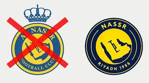
The most noticeable change in Al-Nassr’s new crest is the removal of the crown that once adorned the top of the emblem. This crown, a symbol of royalty and dominance, has been replaced with a cleaner, more streamlined design that emphasizes the club’s name and origins. The English name now reads simply as “Nassr,” dropping the traditional Arabic prefix “Al-,” signaling a modern and global outlook while maintaining its local roots.
Adding “Riyadh” at the bottom of the crest firmly anchors the club to its home city, celebrating the community and fans that have supported the team since its founding in 1955. The year “1955” is also prominently displayed, reminding everyone of the club’s long-standing presence and enduring legacy in Saudi football. Central to the crest remains the map of the Arabian Peninsula, a powerful emblem of regional pride and identity that connects Al-Nassr to the broader Middle Eastern football landscape.

Evolution of the Crest: From Past to Present
Al-Nassr’s visual identity has evolved over the years, with the most recent significant update before this anniversary redesign occurring in October 2020. At that time, the club removed the laurel wreath that framed the crest and the yellow ribbon at the bottom, opting for a simpler and more contemporary look. The 2025 redesign builds on this minimalist approach but adds new elements that deepen the club’s connection to its heritage and locality.
This evolution reflects a broader trend in football branding, where clubs seek to balance tradition with modern aesthetics to appeal to both long-time supporters and new, global audiences. Al-Nassr’s new crest is a testament to this philosophy, honoring the past while embracing the future.
Al-Nassr’s Legacy and Current Standing in Saudi Football
Founded on October 24, 1955, Al-Nassr has grown into one of Saudi Arabia’s most prominent football clubs, boasting a passionate fan base and a history filled with domestic and regional successes. The club’s journey over 70 years has been marked by memorable victories, legendary players, and a commitment to excellence that continues to drive its ambitions.
As the 2024-2025 Saudi Pro League season nears its conclusion, Al-Nassr sits in fourth place with two matches remaining, trailing the confirmed champions Al-Ittihad by 13 points. While the title may be out of reach this season, the club’s refreshed identity and ongoing investments signal a determination to return stronger and reclaim their position at the summit of Saudi football.
Key Features of Al-Nassr’s New Crest
| Feature | Description |
|---|---|
| Crown Removal | Symbolizes a modern, streamlined identity focusing on the club’s name and heritage |
| Name Change | “Nassr” replaces “Al-Nassr” for a global yet rooted appeal |
| Addition of “Riyadh” | Emphasizes the club’s connection to its home city and local fan base |
| Year “1955” | Highlights the club’s founding year and long-standing legacy |
| Arabian Peninsula Map | Maintains regional pride and identity within the crest |

What the New Crest Means for Al-Nassr’s Future
The unveiling of the new crest is more than a cosmetic change; it represents a renewed vision for Al-Nassr as they look to the future. By simplifying the design and emphasizing their roots in Riyadh and the Arabian Peninsula, the club is sending a message of unity, pride, and ambition.
This refreshed visual identity will be a rallying point for players, fans, and stakeholders alike, inspiring a collective effort to achieve new heights. As Al-Nassr continues to compete domestically and in regional competitions, the new crest will symbolize their commitment to excellence and their promise of a bright, promising future.
Frequently Asked Questions (FAQs)
Q1: Why did Al-Nassr remove the crown from their new crest?
The crown was removed to create a cleaner, more modern design that focuses on the club’s name and heritage, reflecting a global outlook while honoring local roots.
Q2: What is the significance of adding “Riyadh” and “1955” to the crest?
Adding “Riyadh” connects the club to its home city and fan base, while “1955” marks the year of the club’s founding, celebrating its 70-year legacy.