
Netflix updated its iPhone app on Monday, introducing a new interface with a new billboard layout, new card transitions, new animation for both the launch and profile screens, updated haptics, and more.
Former Netflix product designer Janum Trivedi tweeted about the update, along with a video of the new app. Trivedi wanted the app to “feel more fluid, delightful, and polished,” he wrote.
When iPhone users launch the Netflix app, a large card of a movie or TV series will take up the majority of the screen.
This billboard design was created to promote a suggested title available on the streaming service. What’s interesting about the update is that the card now employs the parallax effect, which occurs when an iPhone user tilts the device back and forth. Additionally, the title cards are now surrounded by a coloured border that matches the primary colour in the movie/TV artwork.
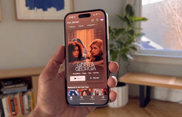
The “Info” tab at the bottom of the card appears to have been removed as well. Users can instead simply click on the card to be taken to a separate page with information about the show or film.
Previously, the app’s card transition was less fluid. The info section would simply slide up when a title was selected. The new card transition shows the card expanding and then opening into a full-screen version.
Also Read: